When your running emulator isn't showing up in the Android Device Chooser

This has been documented elsewhere for similar cases and is more of a note to self than anything else.
Occasionally I have found, while debugging, Eclipse will lose track of the running Android emulator instance. So the emulator is happily chugging away, but will refuse to appear in the 'Android Device Chooser' running device list. Because the emulator takes so long to start, I am loath to kill and restart it, which usually fixes the problem.
With a little bit of Googling I stumbled across someone with a similar issue, who was advised to try the following commands to resolve the problem:
adb kill-server
adb start-server
The Android Debug Bridge documentation talks about the occasional necessity to restart the server when it is 'unresponsive', so this is clearly one of those cases:
In some cases, you might need to terminate the adb server process and then restart it. For example, if adb does not respond to a command, you can terminate the server and restart it and that may resolve the problem.
Permalink - Comments - Tags: Development,Android,Google
Building an Android equivalent to the iPhone toolbar

As is the case with some of my previous Android posts the hard work was done by Nick Maher as he ported his acclaimed Sydney timetable app (TripView) to the Android platform.
I just finished porting my trilogy of history apps to Android. I had some initial issues finding a good alternative to the iPhone's paged UIScrollView, but once that was sorted I needed to decide how I was going to present shortcut functions in the UI.
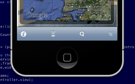
On iPhone the choice was obvious. You create a UIToolbar and add some UIBarButtonItems to it. Easy to build and the stock standard iPhone UI is consistent and looks great.

On Android there isn't such a clear cut choice. If you want to use 'out of the box' code in the SDK, you are kinda out of luck. You could stick the toolbar like features in a menu. But in that case the user needs to click the menu button, then click the common function. Not really ideal, two clicks instead of one and, to me at least, the menu feels like something that has survived from the J2ME days.
I have been to a couple of Google events and the presenters have been fairly vocal about building user interfaces that people like to use. They have posted video's with design pattern recommendations that address this particular problem. The speaker in this talk suggests a 'action bar' for commonly used, app wide functionality. This makes perfect sense and looks great in the presentation slides. Unfortunately there isn't a UIToolbar like object built into the SDK that makes this easy for developers to build.

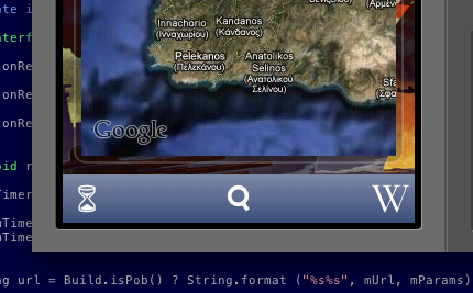
XML layouts make building UI in Android a pleasure and it is actually pretty straight forward to build something that looks like the iPhone toolbar. First you need to define a relative layout in the layout for the activity with the toolbar (N.B. I refer to a couple of image drawables in this first snippet, you just need to replace them with your toolbar button images):
	<RelativeLayout android:id="@+id/toolbar"
    style="@style/Toolbar"
	xmlns:android="http://schemas.android.com/apk/res/android">

	<ImageButton
            android:id="@+id/date"
            style="@style/ToolbarButton"
			android:src="@drawable/hourglass"
            android:text="">
	</ImageButton>

    <ImageButton
            android:id="@+id/search"
            style="@style/ToolbarButton"
			android:src="@drawable/search"
            android:layout_centerHorizontal="true"
            android:text="">
	</ImageButton>

	<ImageButton
            android:id="@+id/wikipedia"
            style="@style/ToolbarButtonRight"
			android:src="@drawable/wikipedia"
            android:text="">
	</ImageButton>

</RelativeLayout>
Then you need to add the styles used in the previous layout to styles.xml in the values res directory:
<resources>

	<style name="Toolbar">
		<item name="android:layout_width">fill_parent</item>
		<item name="android:layout_height">44sp</item>
		<item name="android:background">@drawable/toolbar_background</item>
	</style>

	<style name="ToolbarButton">
		<item name="android:layout_width">44sp</item>
		<item name="android:layout_height">44sp</item>
		<item name="android:layout_centerVertical">true</item>
		<item name="android:scaleType">center</item>
		<item name="android:background">@drawable/toolbar_background</item>
		<item name="android:tint">@color/toolbar_fg</item>
	</style>

	<style name="ToolbarButtonRight" parent="@style/ToolbarButton">
		<item name="android:layout_alignParentRight">true</item>
	</style>

</resources>
The Toolbar and ToolbarButton styles refer to the toolbar_background drawable. This is the guy that defines the look and feel for the toolbar items (this goes in toolbar_background.xml in the drawable directory).
<selector xmlns:android="http://schemas.android.com/apk/res/android">
	<item android:state_pressed="true">
  		<shape android:shape="rectangle">
        	<gradient
              	android:startColor="@color/highlight_top"
                android:endColor="@color/highlight_bottom"
                android:angle="270">
			</gradient>
		</shape>
  	</item>
	<item android:state_focused="true">
  		<shape android:shape="rectangle">
        	<gradient
                android:startColor="@color/highlight_top"
                android:endColor="@color/highlight_bottom"
                android:angle="270">
			</gradient>
		</shape>
  	</item>
	<item>
		<shape android:shape="rectangle">
      		<gradient
            	android:startColor="@color/toolbar_top"
              	android:endColor="@color/toolbar_bottom"
              	android:angle="270">
			</gradient>
		</shape>
	</item>
</selector>
There are some colour definitions that define the nice iPhone-esq gradient on the toolbar_background drawable, so we will need to add those to colors.xml in the values res directory as well.
<resources>
	<color name="toolbar_top">#ff7d88a5</color>
	<color name="toolbar_bottom">#ff3a4e78</color>
	<color name="highlight_top">#ffffc600</color>
	<color name="highlight_bottom">#ffcf9600</color>
	<color name="toolbar_fg">#ffffffff</color>
</resources>
So you just need to hook up your View.OnClickListener for each of the button ids:
findViewById(R.id.date).setOnClickListener(this);
findViewById(R.id.wikipedia).setOnClickListener(this);
findViewById(R.id.search).setOnClickListener(this);
Then do your thing in the handler:
public void onClick(View view)
{
	if (view.getId() == R.id.date)
		// ... you get the idea
That's it.

You can see from the first question in this presentation that developers want this stuff built into the framework and it is pretty clear that Google wants to do this, so hopefully this post will be made obsolete soon and this stuff will be available as stock framework objects.
Permalink - Comments - Tags: Development,Android,Google
More nice Android bits

I am going to talk about Android dev tonight at at GTUG, so I thought I thought I would write down a few other things about Android that are nice.
Slipstream releases
This is the obvious one. It is great not having the pressure when you submit an update, that you will have to agonised about re-submitting for every bug you find in the next fortnight. There is never a time I am not waiting for an app to be approved. I am waiting right now.
Notifications
One of the rare bits of UI on Android where the experience is far better than the iPhone equivalent. True for the user and true for developers adding notifications to their apps.
You have to deal with a bunch of cases when adding push/local notifications to an iPhone app (in the app, background, suspended, local, push) and your UI is pretty inconsistant. On Android you declare yourself a BroadcastReceiver in the manifest and have a single point to handle 'cloud to device' messages. You have complete control over your UI, but I recommend using the NotificationManager to get the standard pull down message UI:
          NotificationManager nm = (NotificationManager) m_context.getSystemService(Context.NOTIFICATION_SERVICE);
          String text = "Stuff in the notification;
          Notification n = new Notification(R.drawable.notification, text, System.currentTimeMillis());
          n.setLatestEventInfo(m_context.getApplicationContext(),
                    "Message Title",
                    text, getIntentForNotificationTap());
          nm.notify(YOUR_NOTIFICATION_ID, n);
Testing GPS
Testing GPS updates in the simulator for iPhone is pretty limited. If you want to send location updates to your app, you are basically reduced to hacking into the simulator binaries and hooking the appropriate libraries, so ... not so much. I spent a lot of time on trains testing my location stuff on the iPhone. On Android you can telnet to the emulator and set it's location on the command line (there has to be something nice about that thing):
$ telnet localhost 5554
geo fix <longitude> <latitude>
Permalink - Comments - Tags: Development,Android,Google
Showing Android resources some love

I have ranted at length on some of the shortfalls I have found with Android development, particularly when compared with my iPhone exploits. However, there are some things about Android dev that I love, so I thought it was time I talked about them.
If you have done much iPhone development you will be pretty familiar with laying out UI in Interface Builder, or if you are one of those ''XIBs are the work of Satan'' guys, then laying out your UI in code. Either way it can get pretty hairy, pretty quickly. In IB you struggle with entering layout through the UI and in code you end up with your UI metrics spread across multiple source files.
Android has a much better solution to UI definition. If you are a web developer, you will find the XML layout definition language pretty familiar. All your UI is nicely contained in source control friendly, well structured XML files.
Let''s say I want to arrange a couple of text views and a custom button view vertically down the page:
<LinearLayout
android:layout_width="1px"
android:layout_weight="1"
android:layout_height="wrap_content"
android:orientation="vertical">

<TextView
android:text="Some bold heading type text"
android:layout_weight="1"
android:layout_width="fill_parent"
android:layout_height="wrap_content"
android:padding="10dp"
android:textSize="16sp"
android:textStyle="bold"
android:textColor="@android:color/black"/>

<TextView
android:text="Some regular text"
android:id="@+id/detail"
android:layout_weight="1"
android:layout_width="wrap_content"
android:layout_height="wrap_content"
android:padding="10dp"
android:textSize="14sp"
android:textColor="@android:color/black"/>

<Button style="@style/Button"
android:id="@+id/something_funky_button"
android:text="Ow! Too Funky!"
android:layout_height="88dp">
</Button>

</LinearLayout>
A couple of things to notice about this snippet:
- Define ids on your views so you can get to them from your code with View.findViewById. All the properties you can define here can be played with from the View subclass. So you have complete control over how things are laid out at design and runtime.
- Padding, layout widths, heights, etc work predictably and intuitively. This makes scaling your app for various devices work out of the box most of the time.
- The style attribute on the Button element refers to a separate style resource, so you can define commonly used UI elements in a single XML file and use it in all your layouts:
<style name="Button">
<item name="android:textSize">18sp</item>
<item name="android:textColor">@color/button_text</item>
<item name="android:textStyle">bold</item>
<item name="android:padding">5sp</item>
<item name="android:background">@drawable/button</item>
<item name="android:layout_width">fill_parent</item>
<item name="android:layout_height">wrap_content</item>
</style>
I have just scratched the surface of what you can do here in your Android project''s resource directory, but it is all pretty awesome stuff.
Permalink - Comments - Tags: Development,Android,Google
What's wrong with Google Maps development on Android - Part Three

Update 5th December 2012 - Android Maps v2
Another sentence from the MapActivity documentation that causes developer pain:
"Only one MapActivity is supported per process. Multiple MapActivities running simultaneously are likely to interfere in unexpected and undesired ways."
This means one MapActivity subclass per Android process and therefore, only one MapView onscreen at any one time. This might not seem like a big deal, but there are times when you would like to have two maps on view at a time. A good example is my WW2 Daily app which lets you swipe locations (and their associated maps) on screen in a scrollview:
To implement this on Android I am going to have to layout image views around my map view and, as the user swipes, replace the adjacent images with a screenshot of the map view, then swap the image view and the map view in the hierarchy. So this is do-able, but compared to keeping multiple map views, a massive pain.
Based on the some of the questions on StackOverflow, this is not a unique gripe with the API (check out the this truly horrible workaround for the issue. Sticking your second map activity in a separate process? ouch!).
This rant continues:
- What's wrong with Google Maps development on Android - Part One
- What's wrong with Google Maps development on Android - Part Two
- What's wrong with Google Maps development on Android - Part Three
Permalink - Comments - Tags: Development,Android,Google
[First Page] [Prev] Showing page 2 of 4 pages [Next] [Last Page]
 Mastadon
 Feeds
Feeds Contribute